Recordário
Designing an AI-native storefront, and the agent system that runs it.
- Problem
- An e-commerce product that does not exist until the customer makes it: every print is generated from their own photographs in about twenty seconds. None of the standard storefront patterns apply.
- What I did
- Designed the preview itself as the conversion event rather than a step toward one, designed the twenty-second wait and the reveal as the emotional peak of the visit, rebuilt the drag experience for the mid-range Android phones 88% of customers actually hold, encoded brand and persuasion as a machine-readable system, and ran the whole thing off a daily analytics agent that reports conversion and proposes the next test.
- Result
- The design does its job up to the reveal: customers author the product on the mid-range Android phones most of them hold, and reach the watercolour reliably. The step from that preview to purchase intent is where it breaks, and that unsolved conversion problem is the part of this case I most want to talk about.
- Role
- Solo founder, designer and engineer
- Scope
- Product design, UX, brand, storefront and the agent system
- Where
- Brazil, ~7 months
- Status
- Live and transacting
A product that doesn't exist until the customer makes it
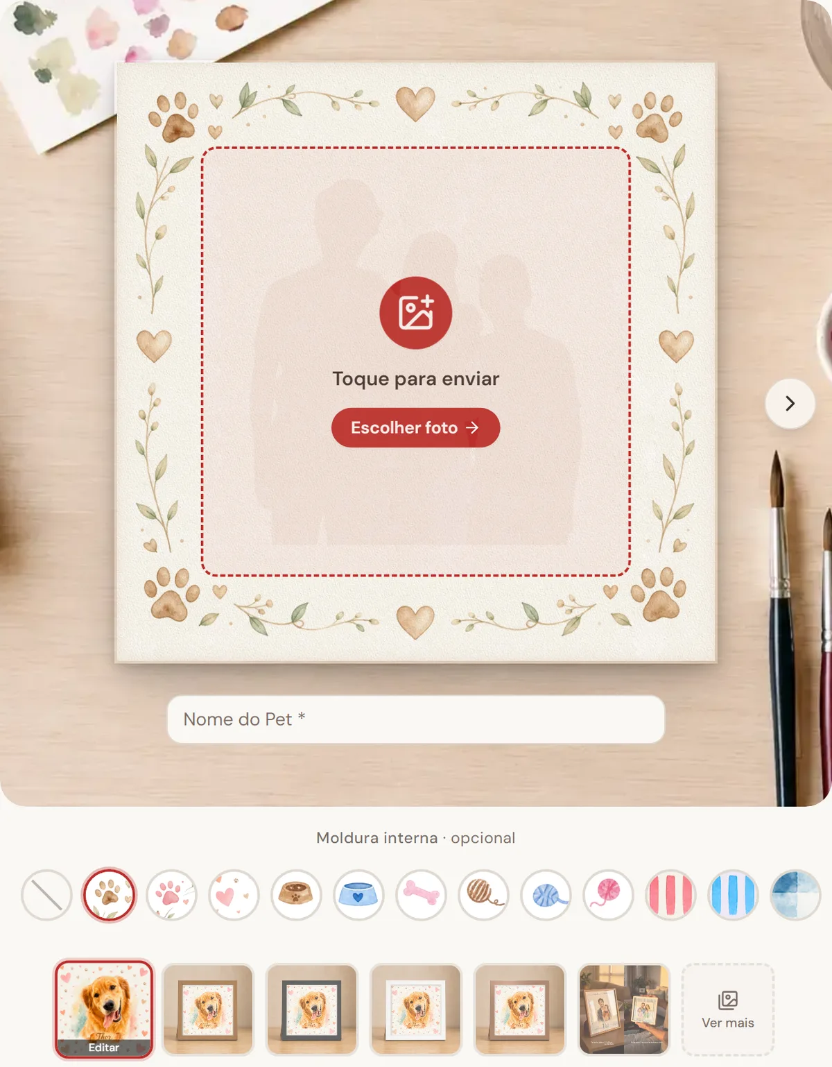
Recordário turns customers' photographs into watercolour fine-art prints: framed art, pet portraits, mother-and-child compositions. I designed and built all of it alone.
Two constraints shaped every decision.
The product doesn't exist until the customer makes it. There is no catalogue photograph that tells the truth. Every unit is generated from the customer's own photos by an image model in about twenty seconds. The patterns e-commerce hands you, meaning product photography, reviews of this item, and a straightforward add-to-cart, don't map onto a product that is authored at the moment of purchase.
One person, no team. A functioning storefront needs content, paid media, creative, analytics and operations. All of it competes directly with building the product.
And then the real device budget: 88% of traffic is Android, much of it mid-range, much of it arriving inside Instagram's in-app browser. Not the machine the design was drawn on.
Two design problems, deliberately treated as one system
Make the customer the author. Move the moment of ownership before the transaction. Design a flow where a nondeterministic, twenty-second generation reads as craft rather than as a loading screen.
Build the operating system for a company of one. Encode brand voice, product truth and persuasion strategy as machine-readable context, so agents could produce content, creative and analysis at volume without diluting taste.
Before building the modal that catches people leaving with unsaved art, I shipped only the measurement: a passive event that records the leaving, changes nothing about it, and runs only while the retention feature is switched off. I wanted the true size of the leak before I built the plug, and a clean baseline to judge the plug against afterwards.
That habit, instrument first and build second, is the one I would most want to be judged on, so it belongs at the top rather than buried in a later section. It is also the habit that caught the two problems in the reflection at the end, both of which are mine.
The bar: a storefront a person trusts enough to upload photographs of their dead pet to, and an operation one person can actually run.
1. The preview is the product, not a step toward it
The endowment effect is the entire strategy. People overvalue what they have made. So the flow hands the customer authorship before checkout: a live canvas on the real fine-art paper texture, their photograph draggable and pinch-scalable, their message repositionable, physical frames and in-canvas frames swappable live. The generated watercolour sits under a multiply blend on the actual paper, so what they see is what ships.
The consequential decision was to make generation free, generous (five per day), and account-free. Each image has real cost. Gating it behind an email would have protected that cost and destroyed the mechanism, because the preview is the conversion event, not a lead magnet.
Instrumented outcome: customers swap the in-canvas frame about thirteen times per preview. I read that as engagement for months. I no longer do, and I come back to it at the end.
2. Designing the twenty seconds before the reveal
The reveal is the peak the whole visit is built around: the watercolour arriving on the real paper. About twenty seconds stand between the customer and it. Long enough that the customer is definitely paying attention, short enough that a progress bar would be the lazy answer. So the wait gets designed as part of the peak rather than as the delay before it.
A twenty-second wait is not dead time. It is the last thing the customer feels before the peak, so it gets designed like everything else.
3. Designing for the device the customer actually holds
Customers were losing their uploads from the third photograph onward. A composition takes four. So the product was breaking at precisely the moment someone had committed to it, and breaking hardest on the mid-range phones most of the audience actually holds.
The fix itself was mundane, so the number is what matters: on the most recent measured day, 44 of 44 upload sessions completed with zero friction. The customer reaches the canvas with all four photographs intact, on the phones where the flow used to break.

The drag gesture took three documented rounds against real device evidence.
The drag gesture, three rounds
- Drag always active. Customers couldn't scroll past the canvas.
- Long-press to arm the drag. Fixed scrolling; the hold itself felt broken.
- Shipped: a tap selects, then dragging is immediate and 1:1. Until you select it, the page scrolls normally past the canvas. Once you have, the element moves the instant you touch it.
Detail work on top: a magnetic centre snap that takes 3% of drift to catch you and 5.5% to let you go, and the asymmetry is the entire reason it feels magnetic rather than sticky. Haptics on snap and on drop. And the gesture runs outside the app's normal rendering path, because updating state on every frame made the drag stutter on exactly the mid-range Android phones most customers are using.
4. Persuasion as a design system, not a copywriting mood
I wrote a persuasion constitution that governs all four channels: ads, social, blog and in-product writing. It's grounded in Ariely and Kahneman, and it starts from one uncomfortable premise about who is actually doing the buying.
System 1 buys. System 2 only looks for reasons not to. In an emotional gift purchase the fast, automatic, feeling mind makes the decision, and the slow rational one arrives afterwards hunting for objections: price, delivery time, risk. Two rules fall out of that and run through every screen. Emotion comes before information, so a price never appears before a feeling. And what Kahneman calls WYSIATI: if the emotional benefit isn't visible on the screen, it doesn't exist for the decision. An unstated benefit isn't a subtle one, it's an absent one.
From there the document is a working arsenal rather than a manifesto. Twelve biases, each with a named job in the product.
The arsenal
| Bias | What it exploits | Where it runs |
|---|---|---|
| Affect heuristic | High emotion lowers perceived risk and price | Every top-of-funnel asset opens on feeling, never on product |
| Endowment, the IKEA effect | We overvalue what we helped make | The living preview. The single biggest lever in the brand |
| Loss aversion | Losing hurts about twice as much as gaining pleases | Leaving and abandoning reframed as losing your art, not missing a discount |
| Anchoring | The first number seen becomes the ruler | The larger framed size is shown before any price appears |
| Decoy and relativity | We judge by comparison, not in absolute terms | A deliberately weaker size option, and a "popular" tag on the target |
| The power of free | Zero carries disproportionate emotional weight | The in-canvas frame is given rather than sold |
| Peak-end rule | A memory is its peak plus its ending, not its average | Peak is the watercolour reveal; the ending is the success page and the emails |
| Anticipation | Anticipating the pleasure is a large part of the pleasure | "Your art is being painted", instead of a tracking number |
| Social proof | "Others like me did this and loved it" lowers risk | Reviews carrying a face and a name, and a count of pieces delivered |
| Sunk cost and commitment | People who have already invested resist abandoning | The purchase button is never blocked; a modal preserves the work instead |
| Availability | The vivid and concrete outweighs the abstract | "Textured cotton paper" rather than "premium finish" |
| Framing | The same fact changes value with its presentation | Delivery as "in time for her birthday", not "seven working days" |
Then each block of the funnel gets one target feeling and one master bias, so any piece of content, mine or an agent's, knows what it is for before anyone argues about wording.
Top
Affect
Feeling first, before any argument about price or product.
Middle
Endowment
The living preview. You made it, so it is already yours.
Bottom
Loss aversion
What you lose by closing the tab, not what you gain by buying.
Every stage, and what it has to produce
| Stage | Target feeling | Master bias | What the customer meets |
|---|---|---|---|
| Top · discovery | Enchantment | Affect | An emotional scene, not the product. No price anywhere, and the call to action never asks for a purchase. |
| Middle · personalisation | Ownership | Endowment | Upload, name, frame, position. Every action deepens authorship before any money is discussed. |
| The peak · the reveal | Awe | Peak-end | The watercolour arriving. The instant the whole memory of the visit is built around. |
| Bottom · decision | Not losing | Loss aversion | Anchor on the larger framed size, the in-canvas frame given free, and the purchase button never blocked. |
| After · post-purchase | Good anxiety | Anticipation | "Your art is being painted", then in production, then shipped. The ending is designed, not transactional. |
What makes this a design system rather than a mood is that every one of those decisions has an event behind it. The frame swap, the room scene the customer zoomed into, the exact stage they abandoned at, the moment they walked away with finished art still unsaved. The constitution says which bias to pursue. The event catalogue says whether it actually worked.
Its governing rule is the part I'm proudest of, because it's a separation of concerns.
This document says which emotion and which bias to pursue. The voice documents say how to write. Persuasion never justifies breaking a brand landmine.
The brand landmines are specific and absolute: no em-dashes in Brazilian copy, never claim "handmade", emoji parsimony, a call to action matched to the funnel stage. In a conflict, the brand wins and the bias loses. That constraint is precisely what made it safe to hand copy to agents without the brand rotting.
The constitution carries a second list, and it turned out to matter more: the anti-biases, the moves that actively destroy conversion. Price before emotion. Latency with no feedback. Delivery time framed as logistics. Invented scarcity, which System 2 detects and never forgives. A lukewarm ending. A gate that blocks the button on someone who has already invested. And choice overload.
Customers swap the in-canvas frame about thirteen times per preview, and then the size decision arrives as a dropdown.
Thirteen swaps is a customer hunting for a decision the screen never makes for them, at the exact moment it should be closing. The system was right and the screen was wrong. The standard on paper cannot tell you which screen needs the work. The event log can, and it pointed straight at this one.
Which leads to the only honest way to close this section: stage by stage, what is the evidence actually saying?
What the evidence says, stage by stage
| Stage | Bias in play | What the numbers show |
|---|---|---|
| Top | Affect | Working at the creative level. Leads at about R$2.19, the best campaign at R$1.29 with a 6.2% click-through. But blended across the window the channel returns 0.88×, so cheap attention is not yet paid attention. |
| Middle | Endowment | Mechanically sound. On the most recent measured day, 44 of 44 upload sessions completed and all 31 generations produced a preview. |
| The peak | Peak-end | Landing. On the most recent measured day every generation reached its preview, about twenty seconds after the customer tapped. |
| Bottom | Loss aversion | This is where it breaks. 31 previews produced 5 purchase-intent clicks. The endowment built in the middle is not surviving the handoff to the decision. |
| After | Anticipation | Live and transacting on instant bank transfer and card, with the post-purchase sequence designed as the ending rather than a receipt. |
Where the funnel actually breaks

The pattern across that table is the thing I'd want to be judged on. The parts of the system I could specify, I got right. The part that depends on reading evidence honestly is the part that is still open, and it stayed open for six weeks while my own daily report was flagging it.
5. The operation a company of one can actually run
One person cannot write the content, run the paid media, produce the creative and read the analytics and also build the product. Each of those hours is taken from the others. So the operation itself is a system: fifteen agents reading a shared hierarchy of context that encodes brand voice, product truth, the persuasion constitution above and the full event catalogue. Two of those documents regenerate from the production database on every build, so the agents' picture of the product never drifts from what customers actually did.
The one that carries this case is the daily analytics agent. Every morning it pulls the site funnel and the previous day's ad spend, works out where conversion moved, writes a dated report, and proposes the next test to run. Thirty-eight consecutive reports. It is the loop that surfaced every problem in the reflection below, including the 84% conversion cliff and the blind spot I built myself.
The same fifteen agents also carry the content and media operation, none of it competing with product time:
- Editorial pipeline. Five agents chained from strategy to publish, straight to the production database. 37 posts live.
- Paid media. Meta and Google Ads managed through agent tooling.
- Social creative team. Visual-first, so the art director leads and a brand guardian holds the brand line.
One more decision worth showing is the autonomy gradient. Each agent's leash is set by the blast radius of its actions, not by a uniform policy.
The autonomy gradient
| Action | Leash |
|---|---|
| Publish an article, commit strategy, write analytics | Fully autonomous |
| Change ad campaigns or spend | Rehearses by default, a human commits |
| Post to Instagram | Agent drafts, a human publishes |
| Restructure content strategy | Agent proposes, human ticks the box |
| Brand review | Advisory only, never blocks |
6. An evidence loop, not a dashboard
Every event in the product is catalogued, and the agents interrogate it live rather than read a frozen chart. They read production, but only read: they never see a customer's personal data, and the keys that could do real damage never sit on my laptop. That is the difference from a dashboard. A dashboard reports what happened. This loop proposes what to do about it.
Ratios and relative changes
Absolute revenue withheld. Read these as the floor the design now stands on: the customer reaches the reveal, which makes the conversion gap in the next section a design problem.
The experience holds up now
| Measure | Where it stands |
|---|---|
| Upload sessions completing | 44 of 44, zero friction |
| Generation to the finished preview | About twenty seconds |
Operating leverage, one person
Paid media efficiency
Eighteen-day window, platform-attributed. The site doesn't yet carry campaign parameters, so the campaign-to-conversion crossover is directional, and I label it that way in my own reports.
- Cost per lead ~R$2.19, best campaign R$1.29 at 6.2% CTR
- Best single day 8.8× ROAS
- Blended across the window 0.88×. The channel is not yet profitable at blend, and I know it.
Live and transacting on both instant bank transfer, with a transparent on-site QR flow, and card.
The three things I'd put in front of a design team first are the ones that aren't solved
The 84% cliff
Thirty-one previews produced five purchase-intent clicks. The preview works. The transition from preview to object does not.
Preview to purchase intent
84% fall off here
My hypothesis is that the endowment effect I engineered creates ownership of the image, not of the thing. The customer already got what they came for. Next test: make the physical object the hero at the moment of approval, at scale, on paper, on a wall, instead of presenting a size dropdown.
What the customer is actually buying
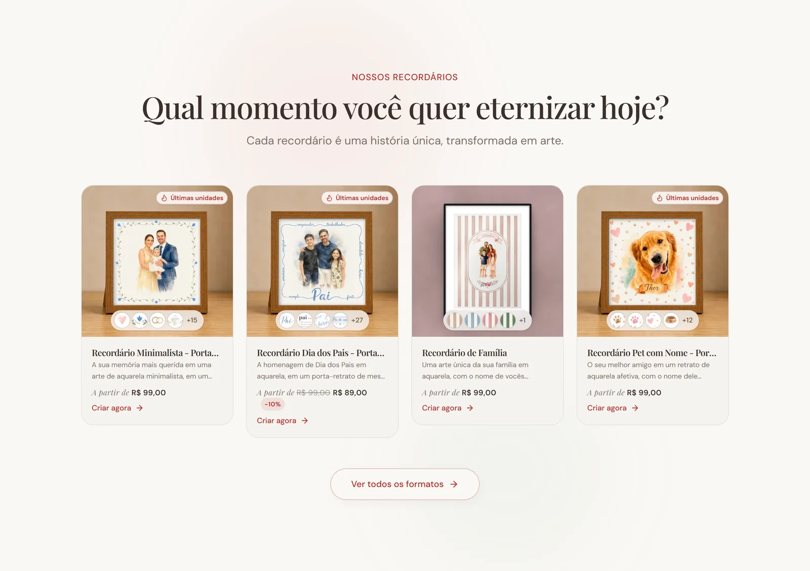
Thirteen frame swaps per preview

I read this as engagement for months. I now think it's Hick's law, choice paralysis arriving at exactly the wrong moment in the funnel. Next test: pre-select a recommended frame and demote the rest to a secondary affordance.
A blind spot I built myself
One funnel event has reported zero for six weeks while the steps on either side of it show traffic. It's broken instrumentation sitting directly on the drop I most need to explain, and my own daily report flagged it independently at both ends of that window while I didn't act on it. The lesson isn't "instrument more".
An evidence loop with nobody accountable to it is just a log.
One more, on judgment rather than metrics: the social pipeline is architecturally complete and barely exercised, one finished post against twenty-four editorial pipeline runs. I built it ahead of need. Given the same seven months again, that capacity goes into the 84% cliff instead.
What this case is evidence of
- Designing for nondeterminism. A twenty-second generation with a different result every time, designed as anticipation and a peak, not a loading screen.
- Systems over screens. A persuasion constitution and a context hierarchy that let non-humans execute brand judgment consistently.
- Autonomy as a design variable. Agent leash length set per action by blast radius; irreversible actions gated, reversible ones free.
- Designing on the real device. Three gesture iterations and an upload path rebuilt for an 88%-Android audience, not a desktop mock.
- Shipping. Design and implementation to production alone: storefront, payments, generation pipeline, admin and the agent layer.
- Evidence, honestly read. A daily analysis loop, and the discipline to publish what it says isn't working.
Want to dig into the evidence loop?
Happy to walk through the persuasion constitution, the daily analytics agent and the conversion problem it keeps flagging, in a call.
View Recordário live Back to selected work