Tourb: from place directory to editorial authority
How I repositioned a ten-year-old urban travel guide when search stopped sending people. Diagnosis, thesis, design system and editorial pipeline. Solo, end to end.
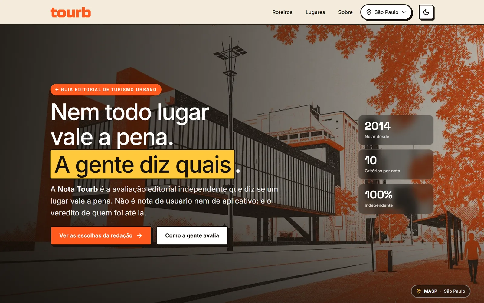
- Problem
- A ten-year-old travel guide lost about 90% of its revenue in twelve months. Search and AI had started answering the questions it used to be paid for.
- What I did
- Threw out the question “how do I win back traffic”. Built a classifier that turns 502 pages into four decisions, designed an editorial scoring layer as the asset AI can’t replicate, and rebuilt the product as an opinionated guide rather than a directory.
- Where it stands
- Ten weeks into a 24-month plan. The instruments and the redesign are shipped and live; the revenue outcome is not in yet, and this page says so rather than manufacturing a curve.
- Role
- Product designer, end to end
- Scope
- Product strategy, UX, design system, editorial, front-end
- Team
- One person
- Timeline
- Started June 2026, 24-month horizon
A model that worked for a decade, until it didn't
In 2014 Tourb launched with a model that held up for nearly ten years: content about places, organic traffic, ad revenue. It grew to 8 cities, more than 500 place pages and roughly 60,000 clicks over 16 months, running at close to zero operating cost.
Then revenue fell about 90% in twelve months.
My first instinct was to treat it as a seasonal dip. The data said otherwise. Three forces were acting at once, and none of them was reversible.
- Search started answering on its own. Maps, "things to do" panels and local results satisfy generic intent without sending a single click.
- AI answers absorbed the top of the funnel. "What to do in São Paulo" became a summary inside search itself. The visit never happens.
- Algorithm updates demoted thin aggregator content, which is exactly the profile of a generic place page.
On top of that sat a structural weakness I had let grow without noticing: a single acquisition channel and a single revenue source. Maximum exposure to any change in somebody else's rules.
The product didn't break. The world around it changed shape.
Revenue, indexed to peak = 100
Changing the question
The obvious question was "how do I win back the lost traffic." I threw that question out early, and it was the most important decision of the project.
The real question was different: what business does Tourb want to be, in a world where search and AI have already absorbed place discovery?
What made it hard to answer was a tension that only surfaced when I crossed 16 months of search data with a page-by-page editorial assessment.
The tension, in one table
| Page type | Share of clicks | Future defensibility |
|---|---|---|
| Generic (beaches, malls, squares) | 50.7% | Low. Precisely what search and AI cannibalise first. |
| Unique and editorial | 48.2% | High. Judgment is what AI doesn't supply. |
| No traffic at all | 1.1% | Neither. Dead weight on both counts. |
What was still paying the bills was exactly what had the least defence in the future scenario. Cutting it on principle would be revenue suicide. Depending on it would mean building on the ground that was sinking fastest.
The constraints were real: a one-person operation, a flat-file PHP stack with no build step, and the obligation to keep earning throughout the turn.
1. I built the instrument before I had an opinion
The temptation was to start cutting weak pages on instinct. Instead I built a classifier that crosses search data with editorial assessment and drops each of the 502 pages into one of four quadrants.
The decision matrix, 502 pages
Editorial bet
Unique, no traffic. Good content that doesn't rank.
103 pages · 0.5% of clicks
Gem
Unique, with traffic. The core to deepen.
180 pages · 48.2% of clicks
Prune
Generic, no traffic. Dead weight.
69 pages · 0.6% of clicks
Consolidate
Generic, with traffic. Earns, but fragile.
149 pages · 50.7% of clicks
Two facts came out of it and reorganised everything else.
- 99% of clicks came from Gem and Consolidate. The 172 pages in the other two quadrants added up to 1% of traffic.
- Four cities held 93.8% of traffic. Another three carried 186 pages for 2.6% of clicks.
Clicks by city, 16 months
That second fact was the hardest to face. It was proof, in my own data, that adding a city without authority doesn't rank. The mistake that brought the site down was mine, not the algorithm's.
Two design decisions about the tool matter more than its code: it suggests, it never executes (every removal passes a human eye), and it runs every month. It isn't a report. It's the live control panel for the catalogue.
2. I built the asset AI doesn't replicate
If the defensible difference is judgment, it has to become a concrete object in the product, not a brand promise.
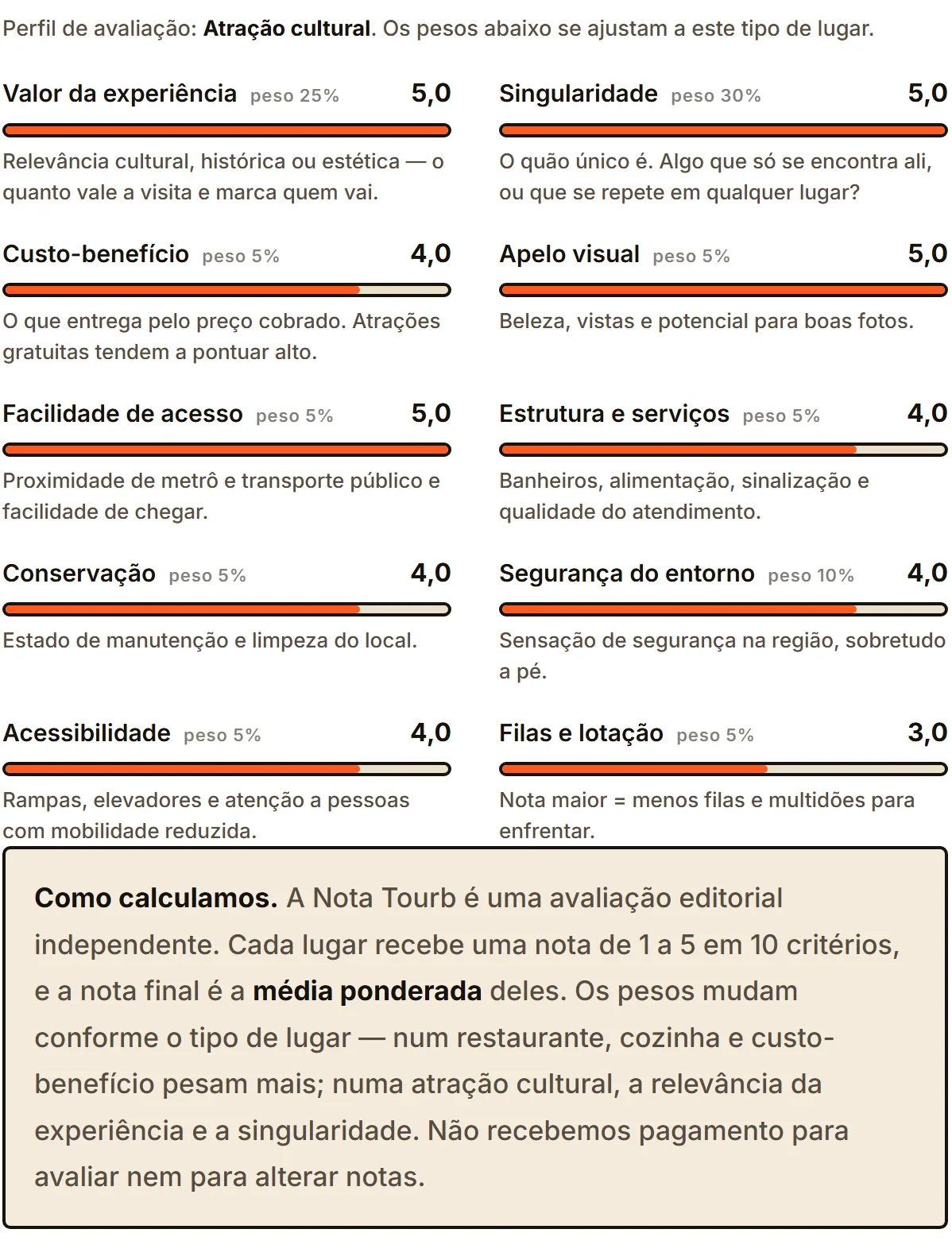
I designed the Tourb Score: a 10-criteria editorial assessment with weights that shift by venue type, covering 100% of the catalogue across all 8 cities.
The ten criteria
- Experience
- Uniqueness
- Value for money
- Visual
- Access
- Facilities
- Upkeep
- Safety
- Accessibility
- Queue
One modelling detail I'm proud of: the weights sum to 100, so the same number works as the weight in the calculation and as the "% contribution" shown in the interface. Data model and interface agree, with no translation in between.
The Tourb Score, on a live page
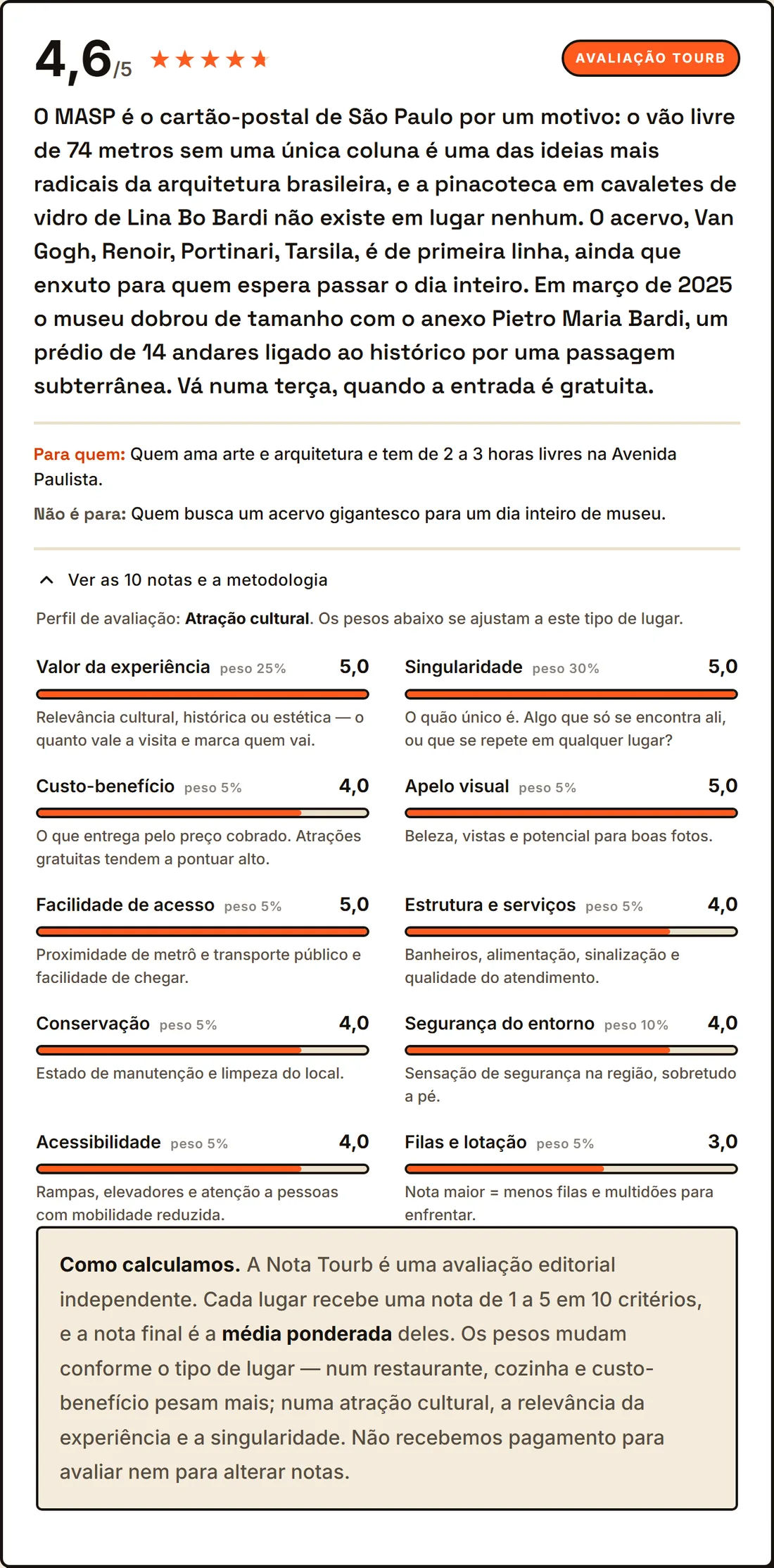
And a deliberate restraint: the score is published as machine-readable data only where search will actually honour it. Parks and beaches keep the block on the page for the reader and claim nothing to the algorithm. I preferred smaller and correct coverage to broad claims that get ignored, because an evaluation asset is worth nothing the moment it reads as gaming.
The methodology is public on the page, with an explicit statement that no payment is accepted. Transparency here isn't decoration. It's what separates a review from an advertorial.
3. I redesigned the product to look like what it had become
An opinionated guide can't look like a directory. The "neo" redesign is editorial and neobrutalist, set in Space Grotesk and Inter on a warm cream.
Core palette
Pressure metaphor, three tokens
Fluid scale
Aa Aa AaThe repositioning, made visible

- One visual vocabulary, decided once. Twenty-six tokens covering surface, ink, brand, structure and rhythm, so a page written next year can't quietly drift away from the rest of the guide.
- Type that scales with the screen instead of jumping at breakpoints. The reading measure stays comfortable from a phone to a desktop, which matters on pages people are meant to actually read rather than skim.
- The redesign shipped without ever taking the site down. Scoping the new design under its own class let it live beside the old one while I converted the site template by template. No big bang, no freeze, and no month without revenue during the turn.
- Reading and navigating work without JavaScript. The city selector and the criteria breakdown use native disclosure elements, so on a weak mobile connection the page is useful before any script has run.
- Accessibility decided at the palette, not patched afterwards. The electric cobalt exists largely to be a legible focus colour on the cream. Motion preferences are honoured, and the score meter announces itself to a screen reader as a full sentence.
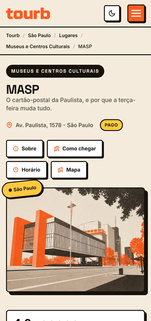
All of it hand-written, without build tooling, because the real constraint was one person maintaining it for years.
The component I like most is the least glamorous, and it's the one that protects the revenue. The ad slot reserves its height so the page can't jump while it loads, collapses when it goes unfilled, and pins its width so an auto-injected ad can't shove the layout sideways. It came out of a real horizontal-scroll bug on mobile and became a standing rule: the thing that pays for the site is not allowed to degrade the experience of it.
4. I built a pipeline for an owned visual identity
Stock photography is a commodity and carries licensing risk. I built an internal tool that generates two-ink risograph illustration from a reference photo, in batches. Nine hundred and one images processed as of 24 August 2026.
The product rule that makes it defensible: the source photo is never published. It goes in only as composition reference, and the prompt instructs the model to reinterpret rather than trace. Reduce to essential shapes, don't copy people or transient elements, no text and no logos. The published asset is the illustration.
The illustration pipeline, mid-catalogue
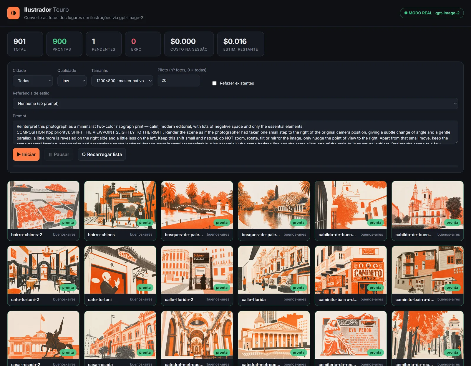
On top of that runs a source cascade, from cleanest to most laborious: free-licence archives, then a photo supplied by the venue itself, then the official press kit. Every image carries recorded provenance, with source, authorship, licence and date.
The result is a visual identity that exists nowhere else, and an entry barrier that no competitor leaning on a stock library can copy.
5. I wrote curation as policy, not as opinion
The principle now governing the catalogue: every page has to justify its own existence through real traffic, editorial uniqueness, or strategic completeness. Anything with none of the three is dead weight. It dilutes authority and invites the perception of thin content.
Better 300 pages that deserve to exist than 500 of which 170 neither rank nor differentiate.
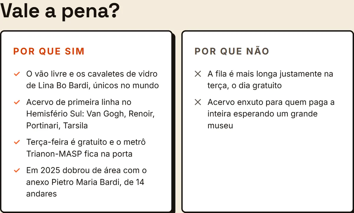
For the gems, I designed a blueprint that stacks a layer of judgment on top of the factual content: verdict first, who it's for and who it isn't, what's worth it and what isn't, the best time to go, the thing regulars know, and what to avoid.
The gem blueprint, stacked on one page
Seven voice principles hold it up. The most important is that the "but" is mandatory: every gem names a flaw. That candour is what builds trust, and it's precisely what no sponsored page ever does.
Architecturally, the enrichment enters as an optional block in the editorial notes file, and the template only renders the new modules when that block exists. Progressive, backward compatible, zero risk to the 320-plus non-gem pages.
And the execution guardrails, which are worth as much as the strategy. Never let a URL break. Never cut a page that has clicks. Hold a maximum pace of 10 to 15 pages a month, so the site never signals instability.
Removing a page, in four stages
- Noindex and drop from the sitemap. Search stops indexing, the page stays up.
- Monitor 30 to 60 days in Search Console. Did it have latent traffic?
- 301 to the most relevant category hub, preserving link equity and residual traffic.
- Remove from the catalogue, and only once the redirect is stable.
The hardest decision was the decision to do nothing. No new cities for six months. I already had three cities with 186 pages generating 2.6% of traffic. Adding a ninth would repeat exactly the mistake that brought the site down, which is breadth without authority. I put a gate at month 6, with objective criteria, so the next city is a decision and not an impulse.
What exists today that didn't before
The plan runs on a 24-month horizon and started in June 2026. The first milestones are executed. Being honest about that is worth more than manufacturing a curve.
- A decision instrument that turns 502 pages into four clear decisions, runs every month, and replaced intuition with criteria.
- An editorial judgment layer covering 100% of the catalogue, published with open methodology and structured data built to be citable.
- An in-house design system, with accessibility decided at the base rather than retrofitted, migrated onto a live site without a single day of downtime.
- An authored illustration pipeline that solves visual identity and licensing in the same move.
- A written catalogue policy, with an entry bar, a four-stage exit process and guardrails that stop haste from undoing the work.
What changed in kind: Tourb stopped being an aggregator competing for generic keywords and became a source with a declared methodology and a signed opinion. The goal stopped being a return to the peak. It became trading fragile, large revenue for a smaller, defensible base.
What I'd take from this
Three things that changed how I work, and that are worth more than the case itself.
- Instrument before opinion. I had strong opinions about which pages were weak. The classifier disproved most of them. Building the ruler before measuring cost a week and avoided months of cutting the wrong things.
- The metric that sustains you can be the one that condemns you. Half my revenue came from the page type with the least future. Seeing that broken out was uncomfortable, and it's what unlocked the strategy.
- The mistake wasn't the algorithm, it was the breadth. Eight cities looked like growth. They were three cities diluting the authority of the other five. Scale without depth is debt disguised as progress.
Want the version with the numbers in it?
Happy to walk through the classifier, the score model and the migration in a call.
View Tourb live Back to selected work